05 · Hospitality · Rebranding, social & art direction
Lulu
Japanese precision, Latin heat — a social-first evolution of an identity that already worked.
- Year
- 2026
- Sector
- Sushi & poké bar
- Scope
- Rebranding, social direction
- Also
- Art direction, content system
The idea
The identity is not the problem. The way it shows up is.
Lulu already owned the good stuff: an elegant wordmark, deep forest green and warm gold, and a Japanese-Latin food proposition nobody else in the city had. On social, all of it was being diluted — competing typefaces, promo overlays, undirected AI imagery and tiki cues that dragged a premium brand into themed-restaurant territory. So the work was evolution, not reinvention: keep the wordmark, the palette, the rooms and the menu, and rebuild the visual world around them.
Current-state audit
What the feed saidEvery post is shouting
Multiple typefaces, overlays and logos competing inside a single frame.
Inconsistent image language
Lighting, colour and quality shifting post to post, killing recognition.
AI without a system
Generative imagery used as output instead of a directed tool.
Promotion over desire
A feed behaving like a stack of flyers rather than making the food wanted.
Overused tropical cues
Literal leaves and tiki styling pulling the brand somewhere dated.
Premium logo, generic presence
The logo promises elegance; the execution didn’t deliver it.
“Japanese precision. Latin heat.”
Premium, but never formal. Bold, but never visually chaotic. An urban food brand with the restraint of Japan, energised by the colour and intensity of South America.
Creative direction
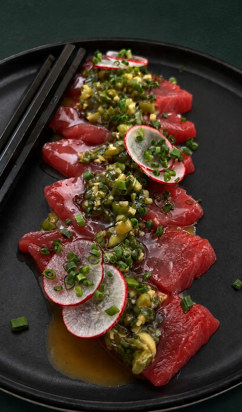
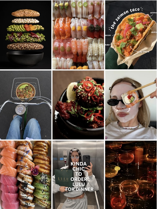
A visual system built on contrast: a nocturnal green-and-black canvas, food as the brightest tone in the frame, macro detail you can almost taste, and one idea per post with room to breathe.
Dark foundation
Deep green and black as a sophisticated canvas.
Food as colour
Salmon, tuna, chili, mango, avocado do the shouting.
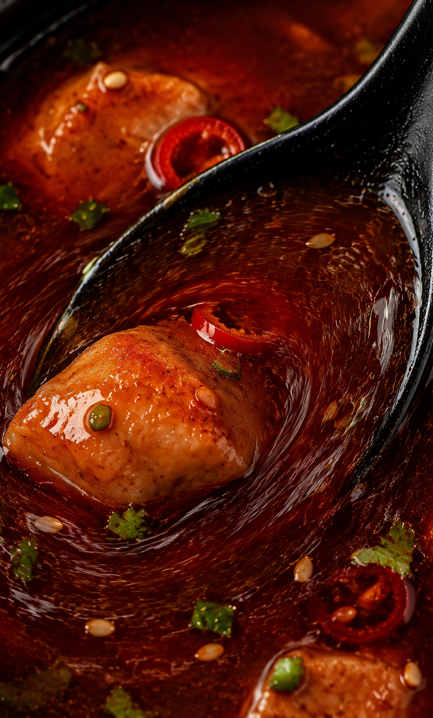
Tactile detail
Macro on sauce, glaze and fish — immediate, close.
Controlled energy
Motion, flash and playful concepts, never clutter.
Human moments
Hands, bikes, takeout, self-care — lived-in.
One idea per post
A single visual hook with space around it.
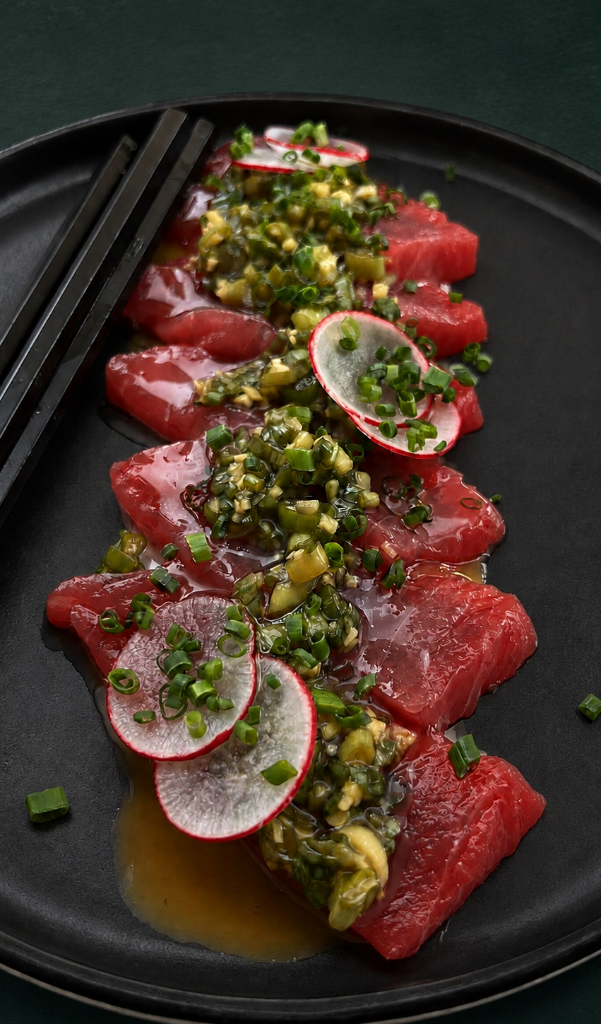
Product imagery
Make the food impossible to ignore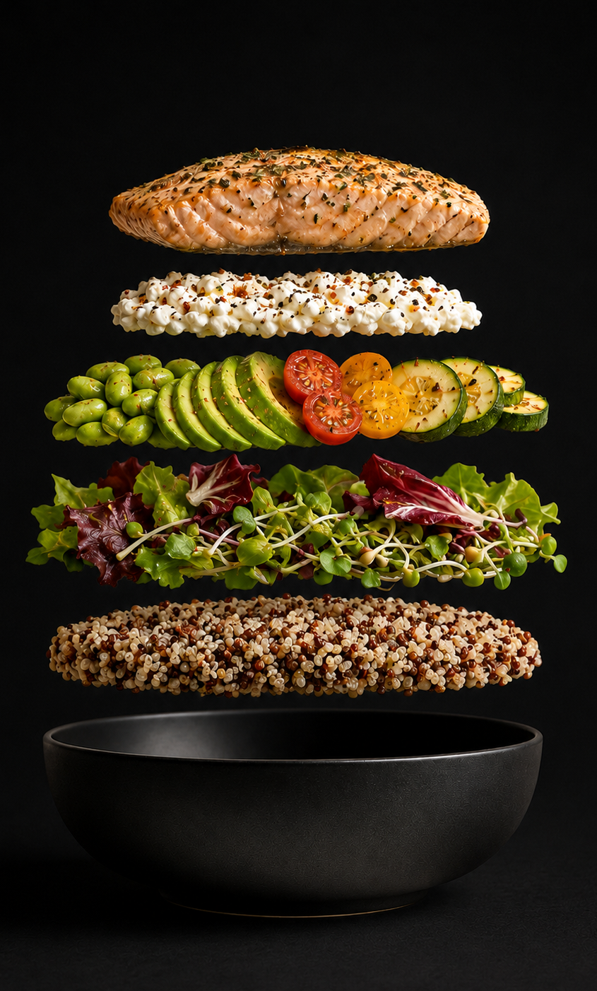
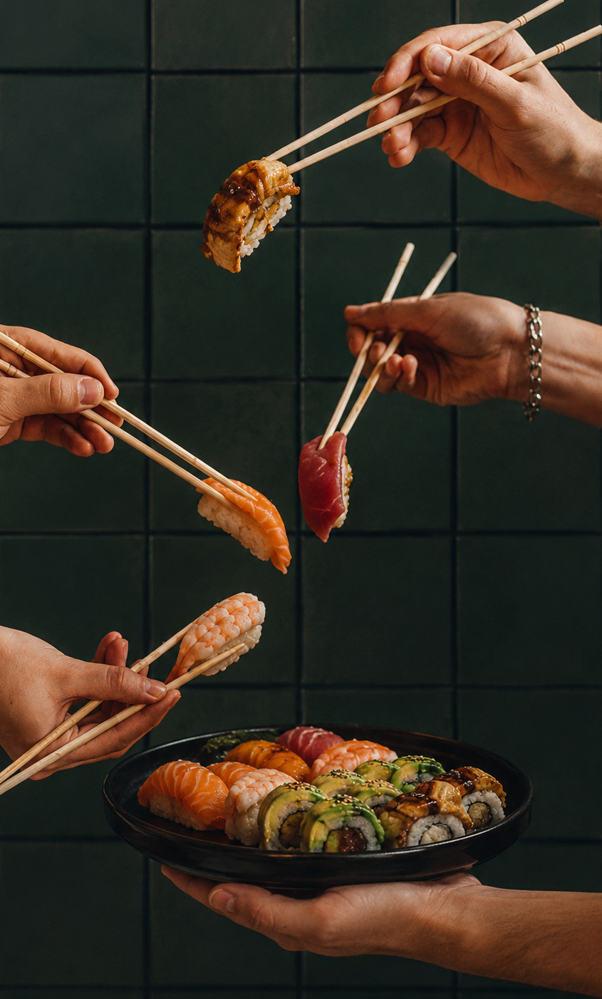
Lifestyle
Lulu as part of the moment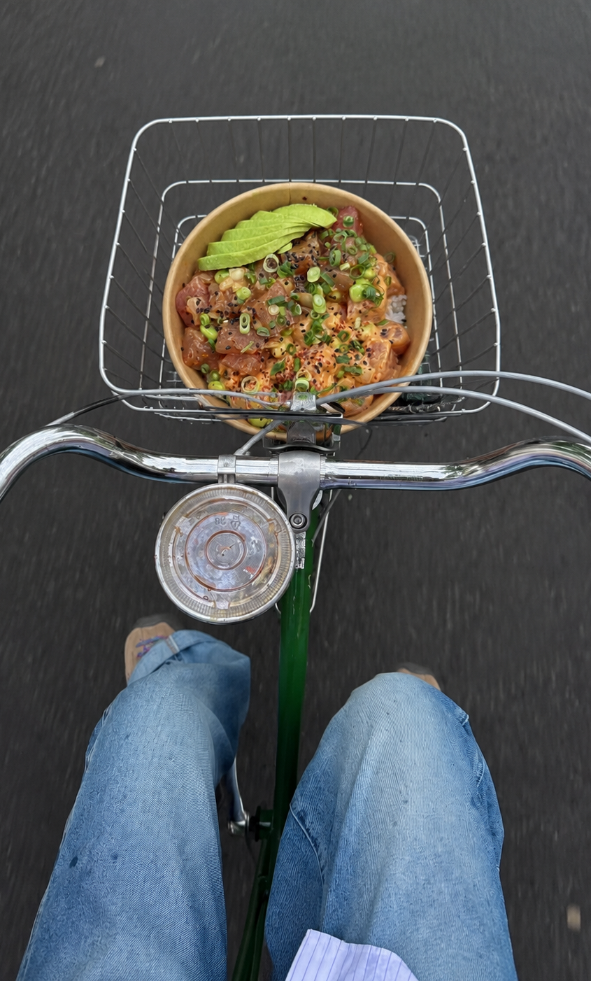

Four pillars. One recognisable world.
Product
Editorial food photography, macro details and hero dishes that build appetite.
Experience
Dinner, cocktails, sharing and takeaway moments that expand the occasion.
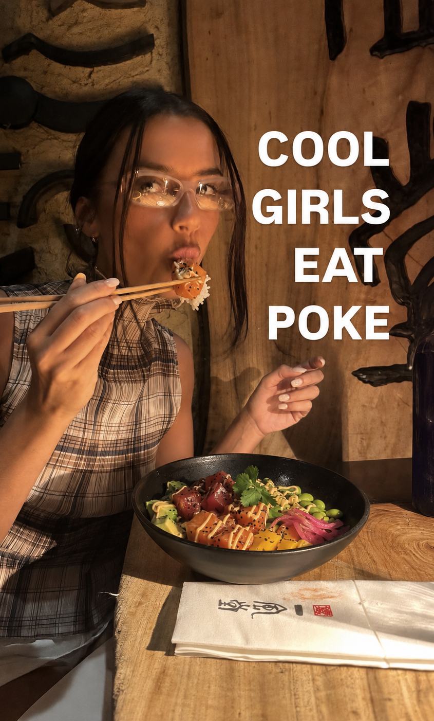
Personality
Playful social statements and culturally fluent images built to be shared.
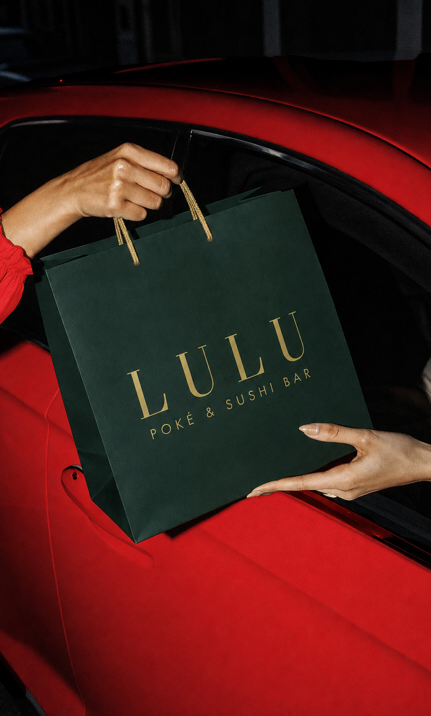
Brand
Profile, packaging, receipt graphics, locations, menu and service comms.
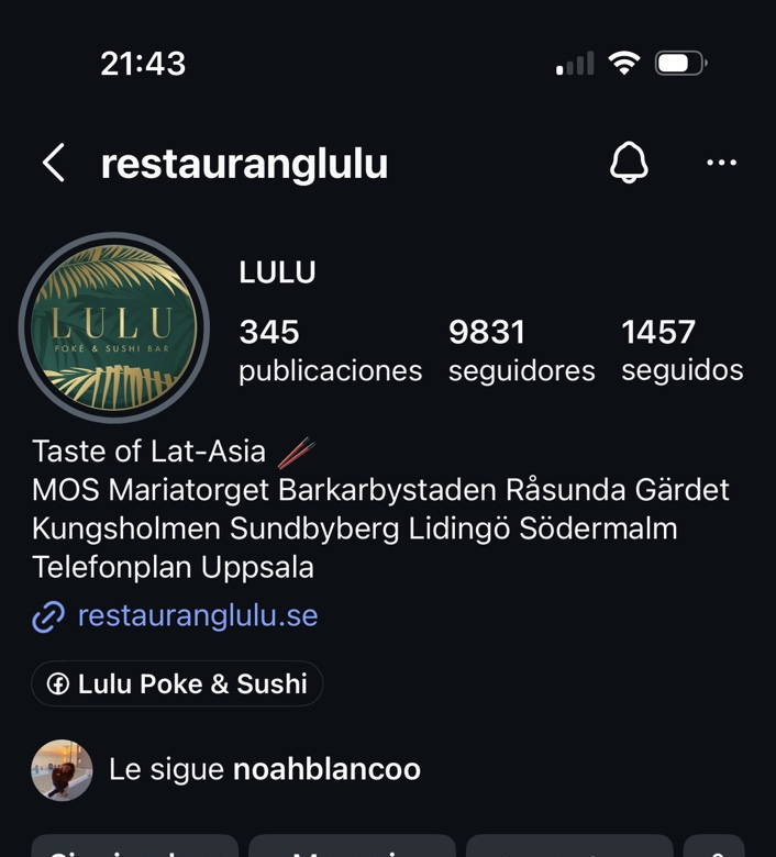
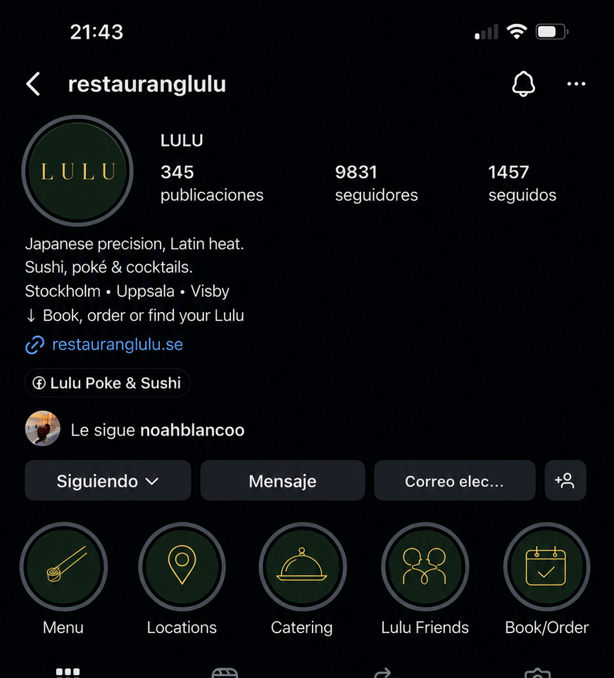
Profile transformation
A clearer first impressionBefore
After
The visual universe
Coherent, flexible, built to grow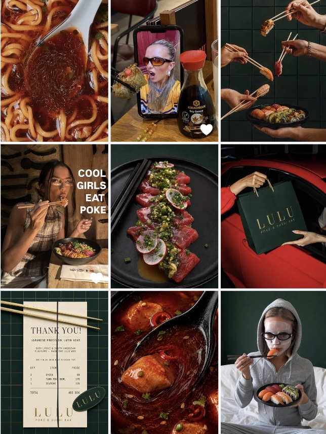
Rollout
Social-first, realisticReset
New profile image, bio and highlights. Archive only what visibly conflicts.
Launch
Introduce the world through a coordinated nine-post grid and one clear statement.
Build
Repeatable templates for launches, lunch, locations, takeaway, catering, Lulu Friends.
Sustain
A monthly mix of real photography, directed concepts and restrained graphics.
Lulu already has the assets. Now it needs the world.
Next
Cheap Noodles →