06 · Fast food · Social visual direction
Cheap Noodles
Making cheap feel culturally expensive.
- Year
- 2026
- Sector
- Fast food · Stockholm
- Scope
- Positioning, social direction
- Also
- Art direction, tone of voice
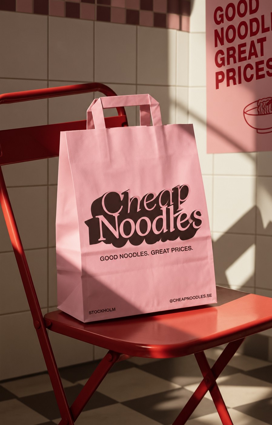
The idea
It already looks like a brand. It just doesn’t communicate like one.
The pink, the name, the logo and the no-nonsense fast-food format give Cheap Noodles a base most brands would pay for. On social, that personality was getting diluted by inconsistent formats, disconnected visuals and posts that explained the product instead of making people want to be part of the brand. The work: turn an already recognisable identity into a coherent, young and culturally relevant social world — evolution, not reinvention.
Current-state audit
What the feed said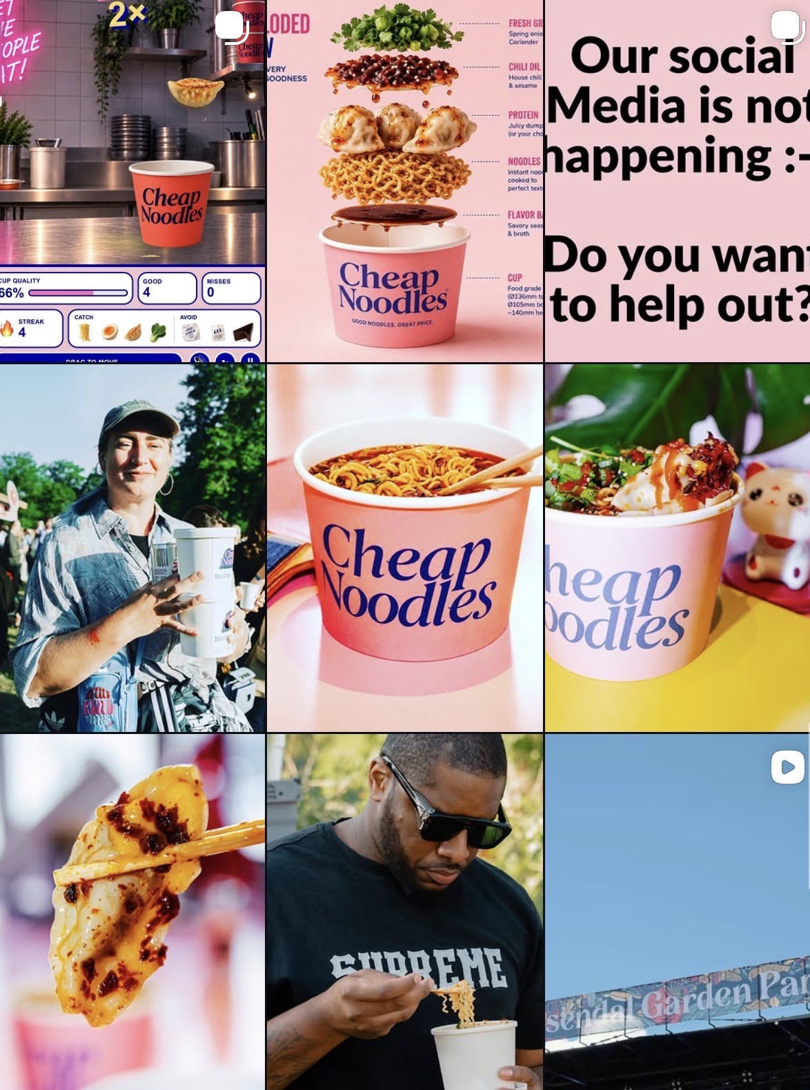
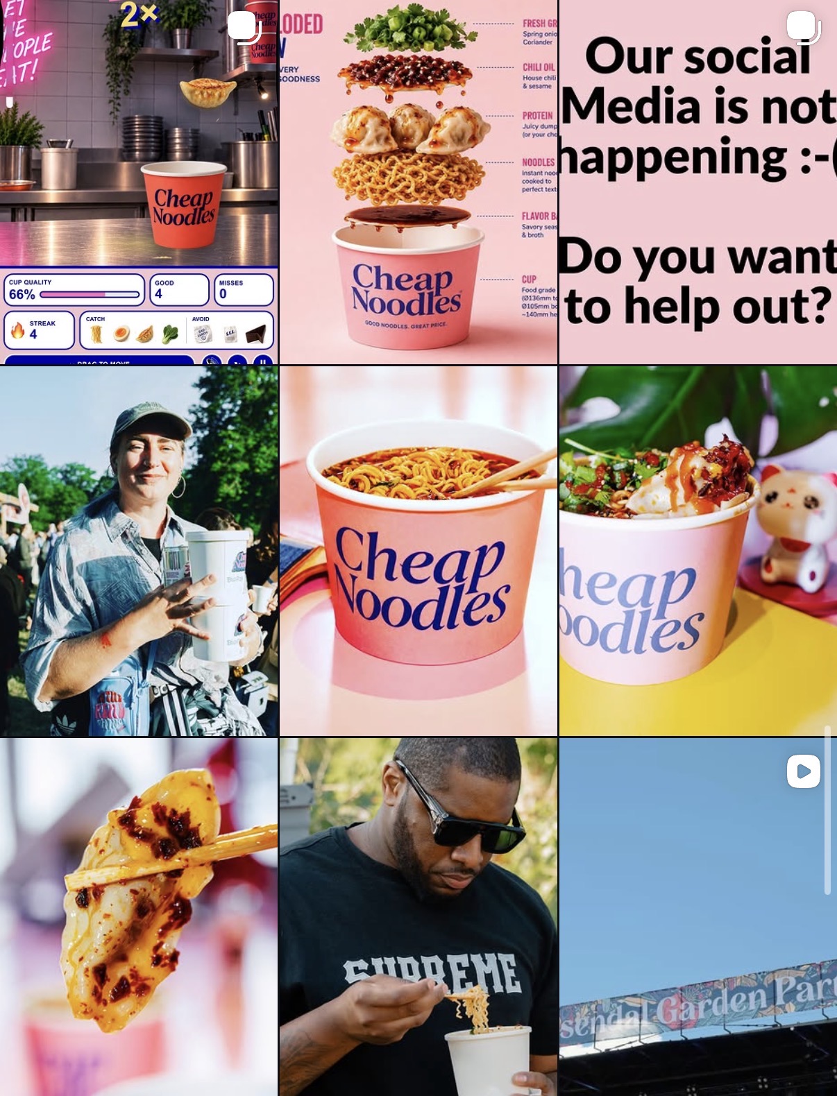
Pink, but not a system
Pink creates recognition, but it was the only thing holding the feed together.
Product without desire
The food shows up often, rarely with the art direction that makes it craveable.
Missed cultural potential
The name is a brilliant social hook; price wasn’t yet part of the voice.
Content over brand
Posts read as individual pieces instead of chapters of one world.
Too much explaining
Information where the strongest assets are the product and the attitude.
Good assets, weak consistency
Distinctive logo and packaging, surrounded by communication that didn’t match.
“Stockholm is expensive. We’re not.”
Cheap stops meaning low quality and starts meaning smart, effortless, young and cool. Fast. Craveable. Self-aware. Social-first.
Creative direction
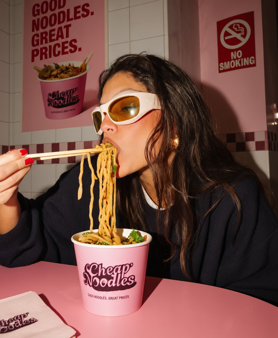
A visual system built on appetite plus attitude: keep the pink dominant, make the food immediate, and put the cup inside real life instead of inside a studio.
Pink as a signature
Pink dominant, supported by burgundy, brown, cream and black.
Food that hits
Macro, gloss, sauce, steam, chopsticks and movement.
Flash + real life
Polished food imagery mixed with candid flash and imperfect moments.
Product placement
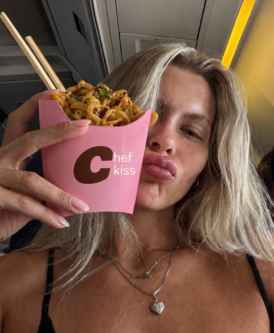
The pink cup in cars, streets, parks, trains and nights out.
Internet-native copy
Short lines that feel like captions people would actually repost.
One hook per post
Appetite, attitude or a cultural joke — one reason to stop.
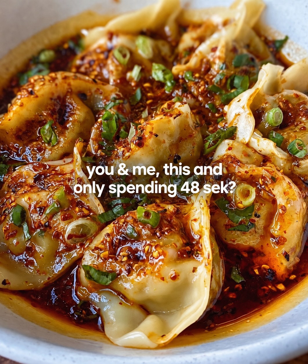
Crave it
Impossible to scroll past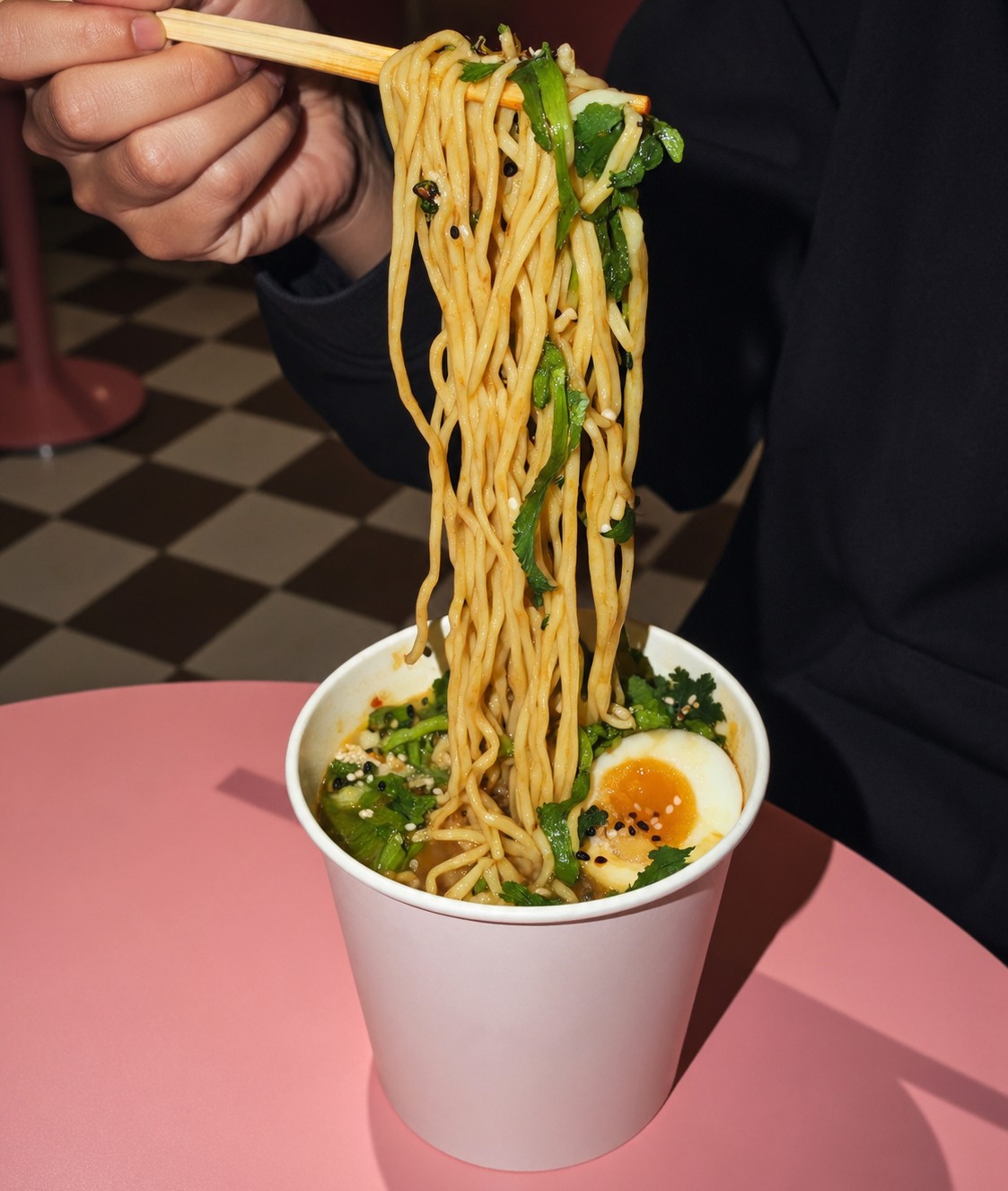
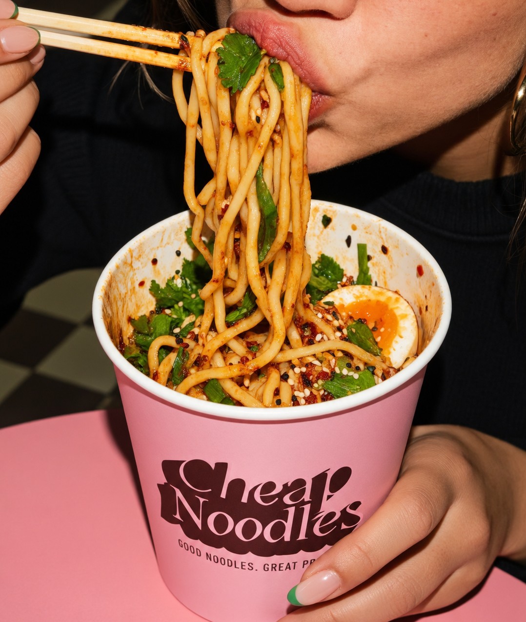
Live cheap
Noodles as part of the moment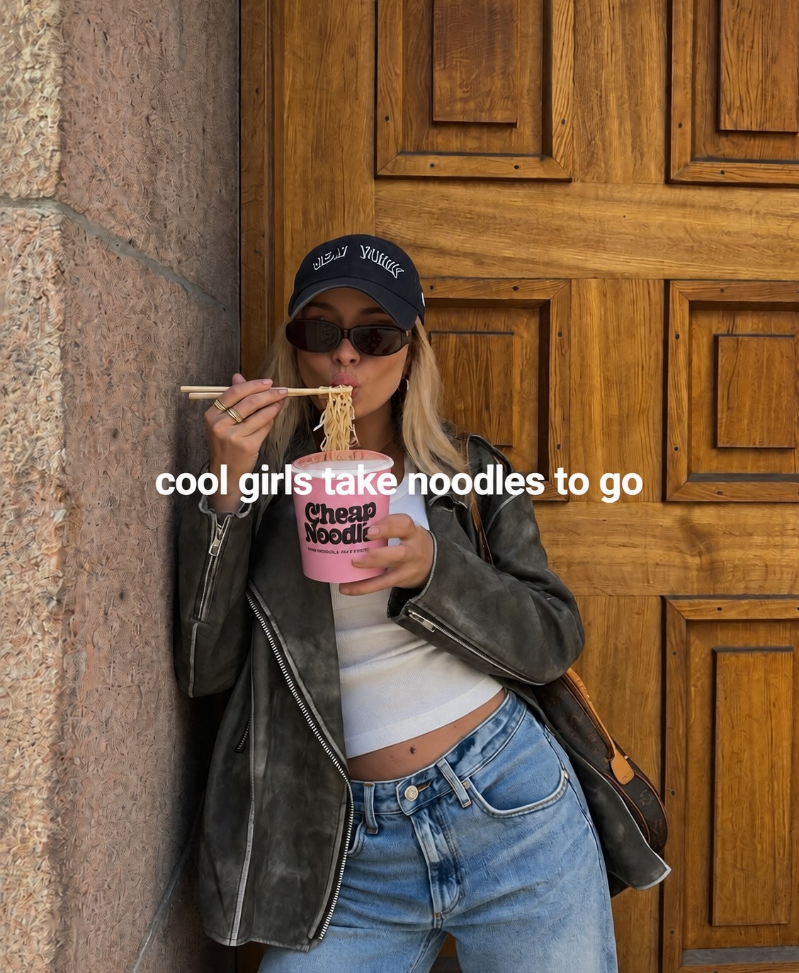
Three pillars. One recognisable world.
Crave it
Macro product photography, sauce, texture and movement built to trigger appetite.
“I need this right now.”
Live cheap
Noodles inside real moments: in the car, on the street, after class, before the train.
“This is my kind of place.”
Cheap talk
Shareable statements and culturally fluent copy that turn price into personality.
“I love this brand.”
Tone of voice
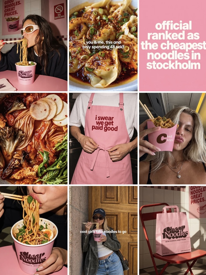
Price as culture, not promotion- kinda chic to eat noodles in the car
- my cheat meal is pink and only 65 sek
- she’s expensive. her lunch isn’t.
- stockholm is expensive. we’re not.
- financially responsible but make it cute
- cool girls take noodles to go
Profile transformation
Same brand. Same pink.Before
After
Rollout
Social-first, realisticReset
Define the visual rules, tone of voice and profile hierarchy. Archive only what visibly conflicts.
Launch
Introduce the new world through a coordinated nine-post grid: crave, lifestyle, personality.
Build
Repeatable formats for product, price, locations, takeaway, launches and carousels.
Sustain
A monthly mix of pro food photography, directed concepts, UGC-style shots and graphics.
Cheap Noodles already has the assets. Now it needs the attitude.
Next
Antiq →