03 · Beauty · Identity, packaging & campaign
Antiq
Make up that doesn’t look like make up — and a brand that doesn’t look like beauty.
- Year
- 2026
- Sector
- Beauty essentials
- Scope
- Strategy, identity, packaging
- Also
- Art direction, merch, campaign
The idea
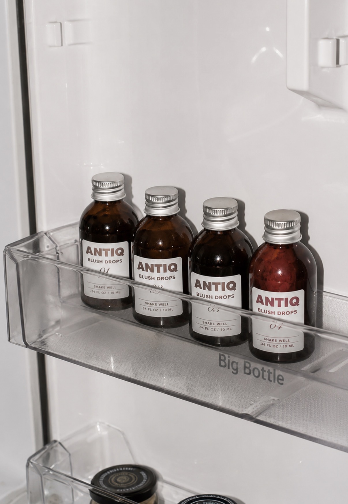
Beauty had gotten loud. Antiq had to feel like a pharmacy shelf you inherited.
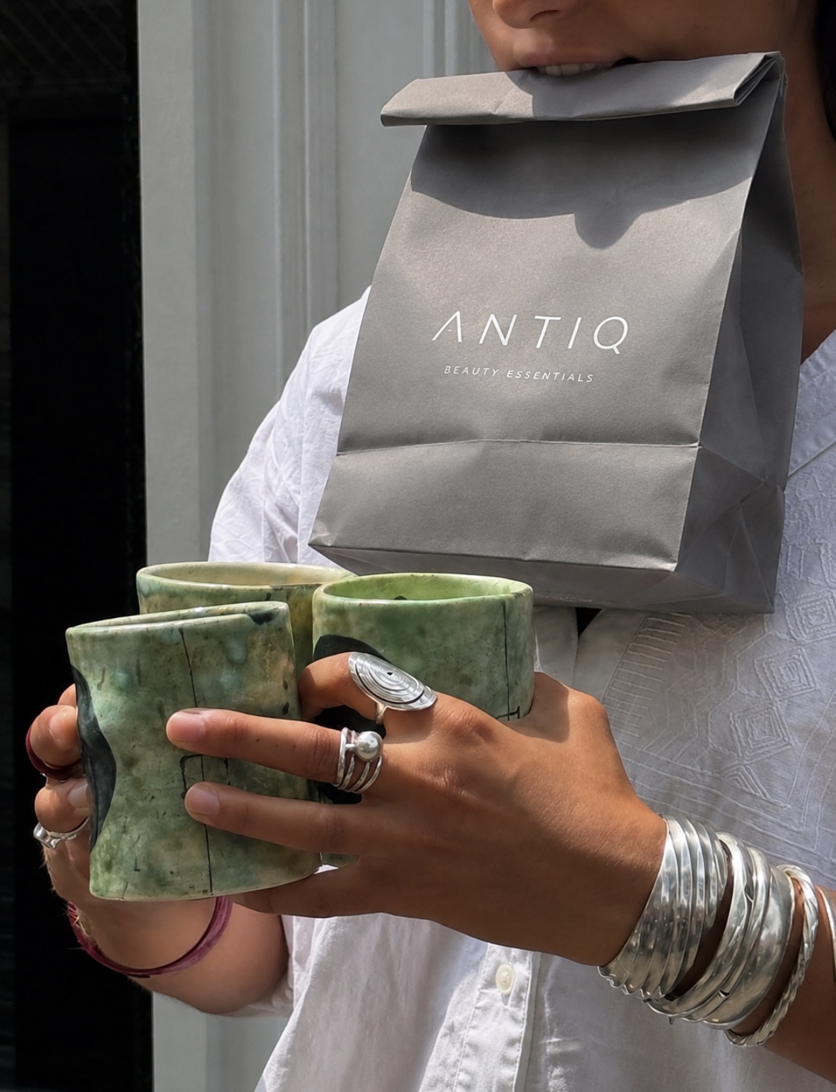
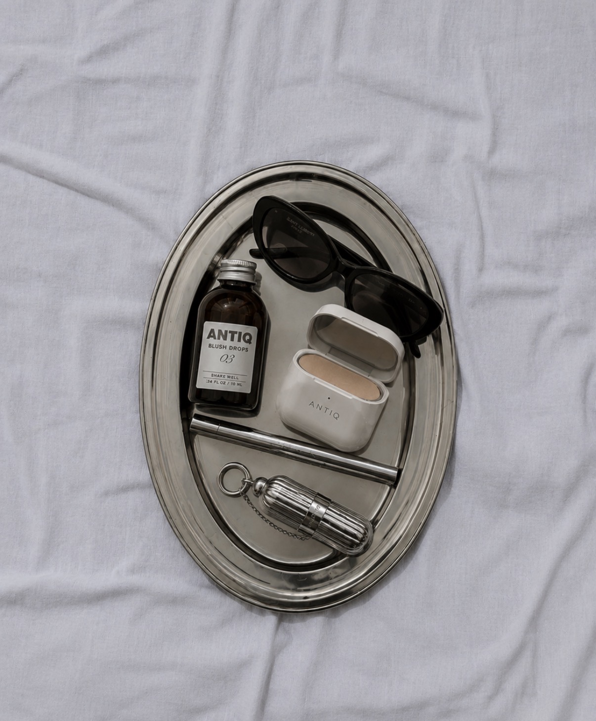
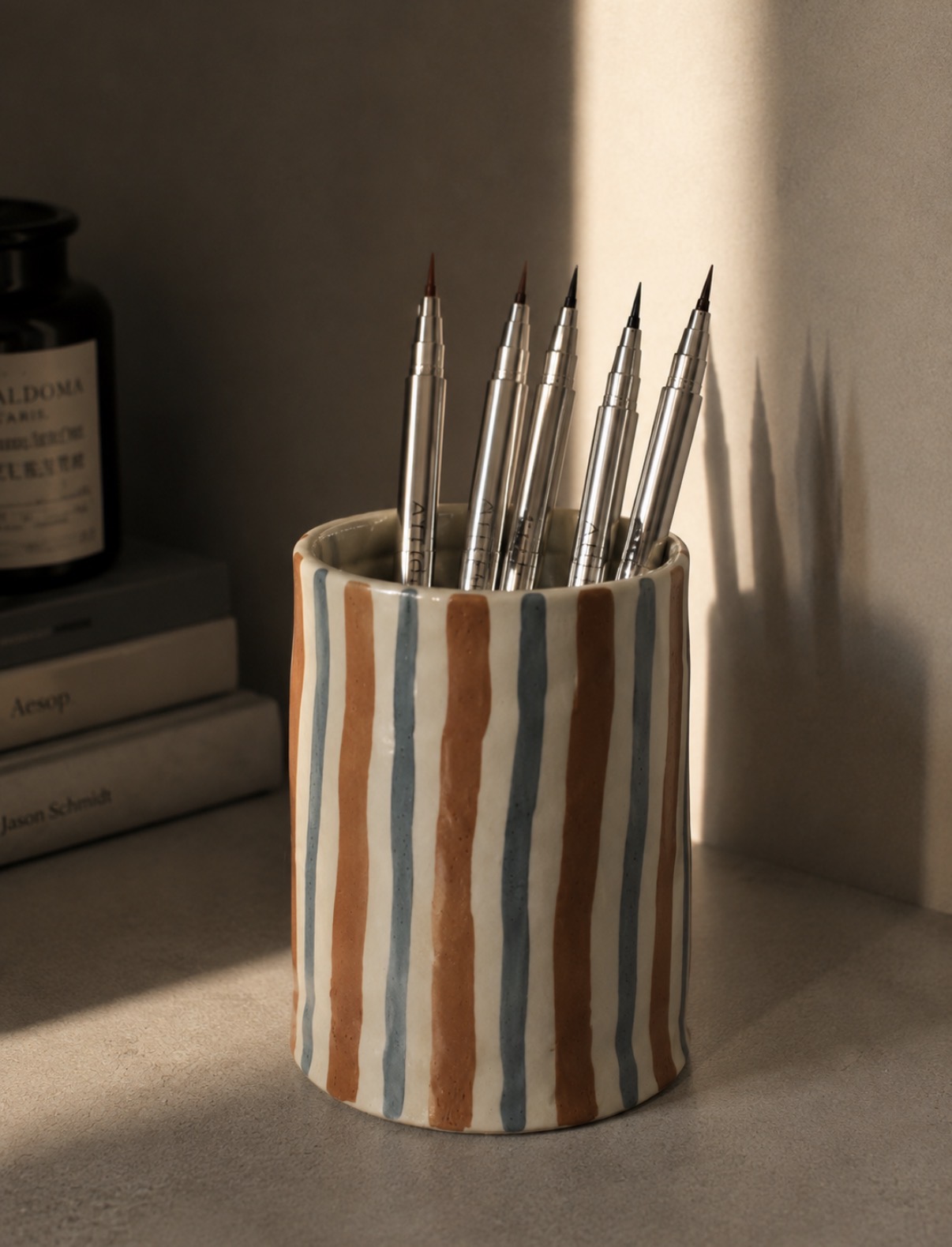
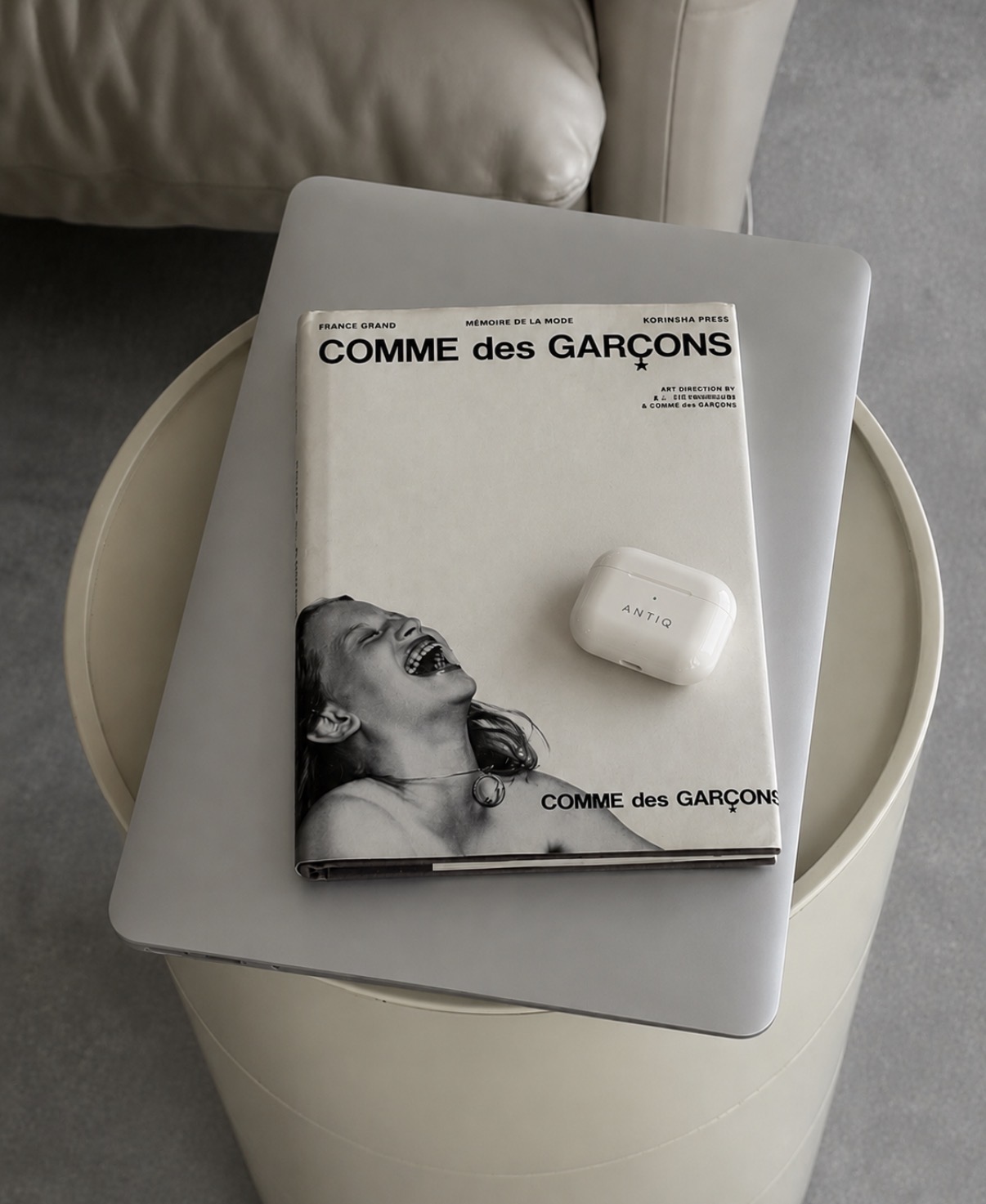
Apothecary bottles, clinical labels, a wordmark set in wide, quiet letterforms. Nothing glossy, nothing shouty — the kind of object that looks better after a few weeks on your nightstand. The whole system is built so the product disappears into your life instead of announcing itself.
Drops
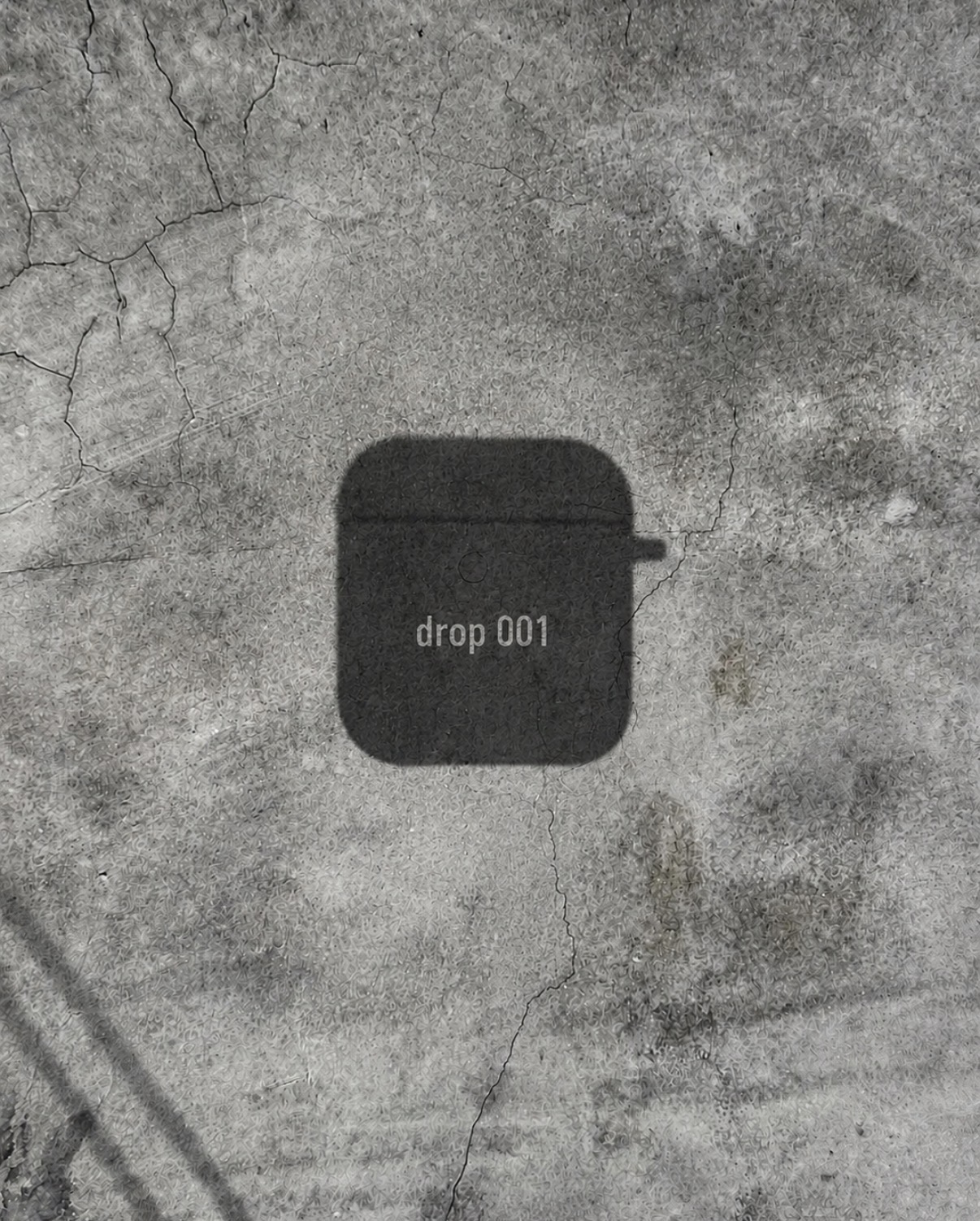
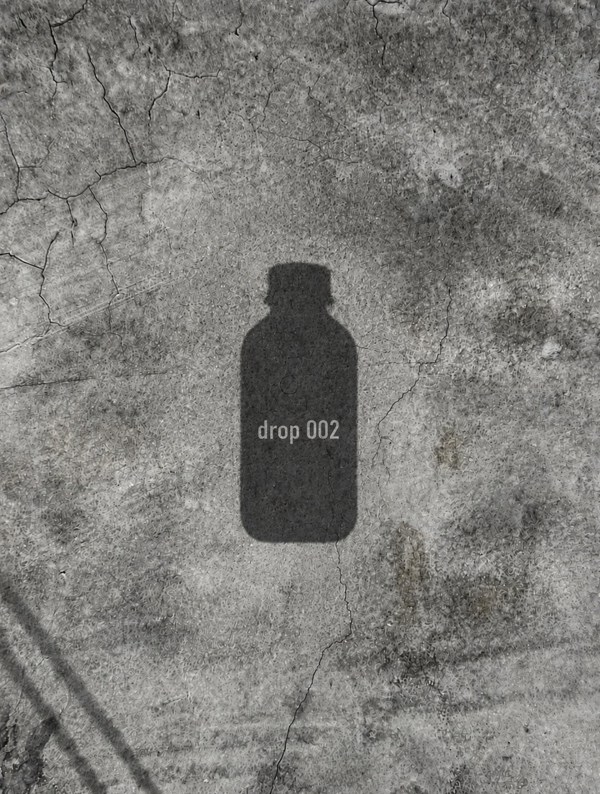
001 — 002Launch teasers built entirely from shadow: the silhouette of the product cast on concrete, numbered and released without a single beauty shot.
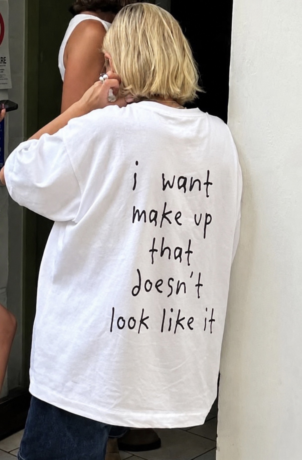
“i want make up that doesn’t look like it.”
The line came out of a customer interview and never left. It became the tone of voice, the merch, the caption, the whole argument.
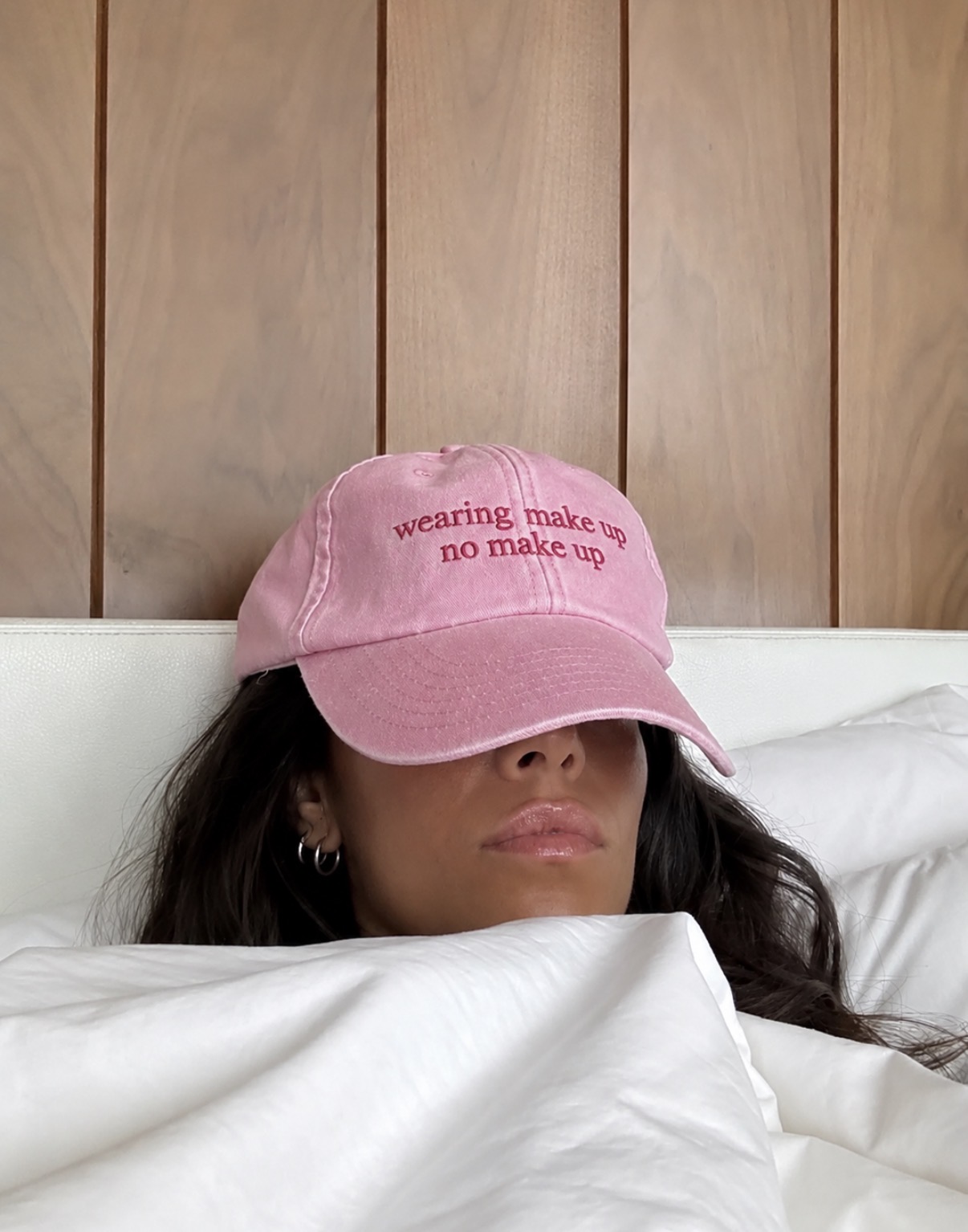
Campaign & art direction
2026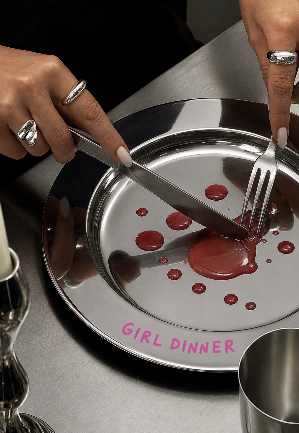
Next
Casa Carpio →