04 · Interiors · Identity, packaging & product
Casa Carpio
Interior objects shaped like the things we drew as kids — wobbly, glazed and kept forever.
- Year
- 2026
- Sector
- Interior design
- Scope
- Strategy, identity, packaging
- Also
- Product naming, art direction
The idea
Everything here started as a shape someone drew without thinking.
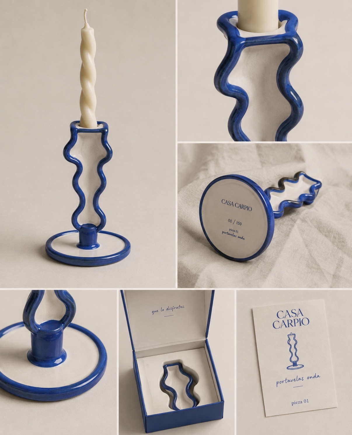
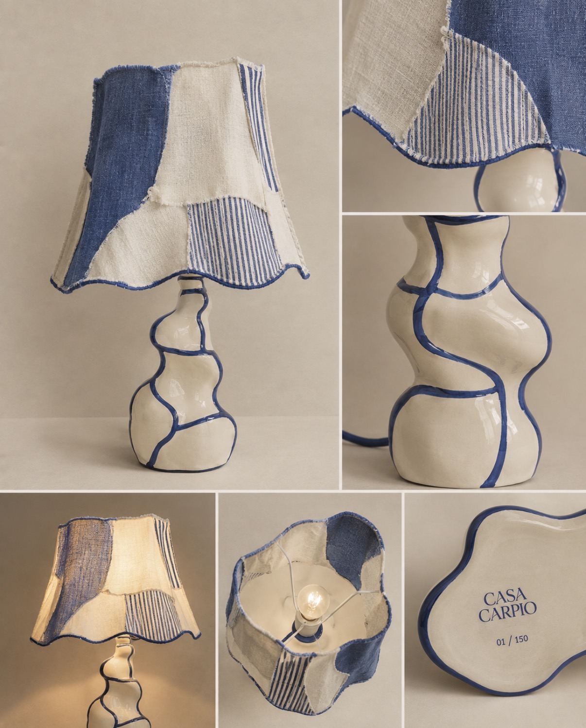
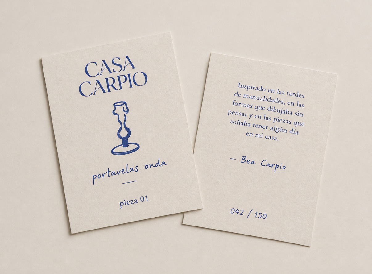
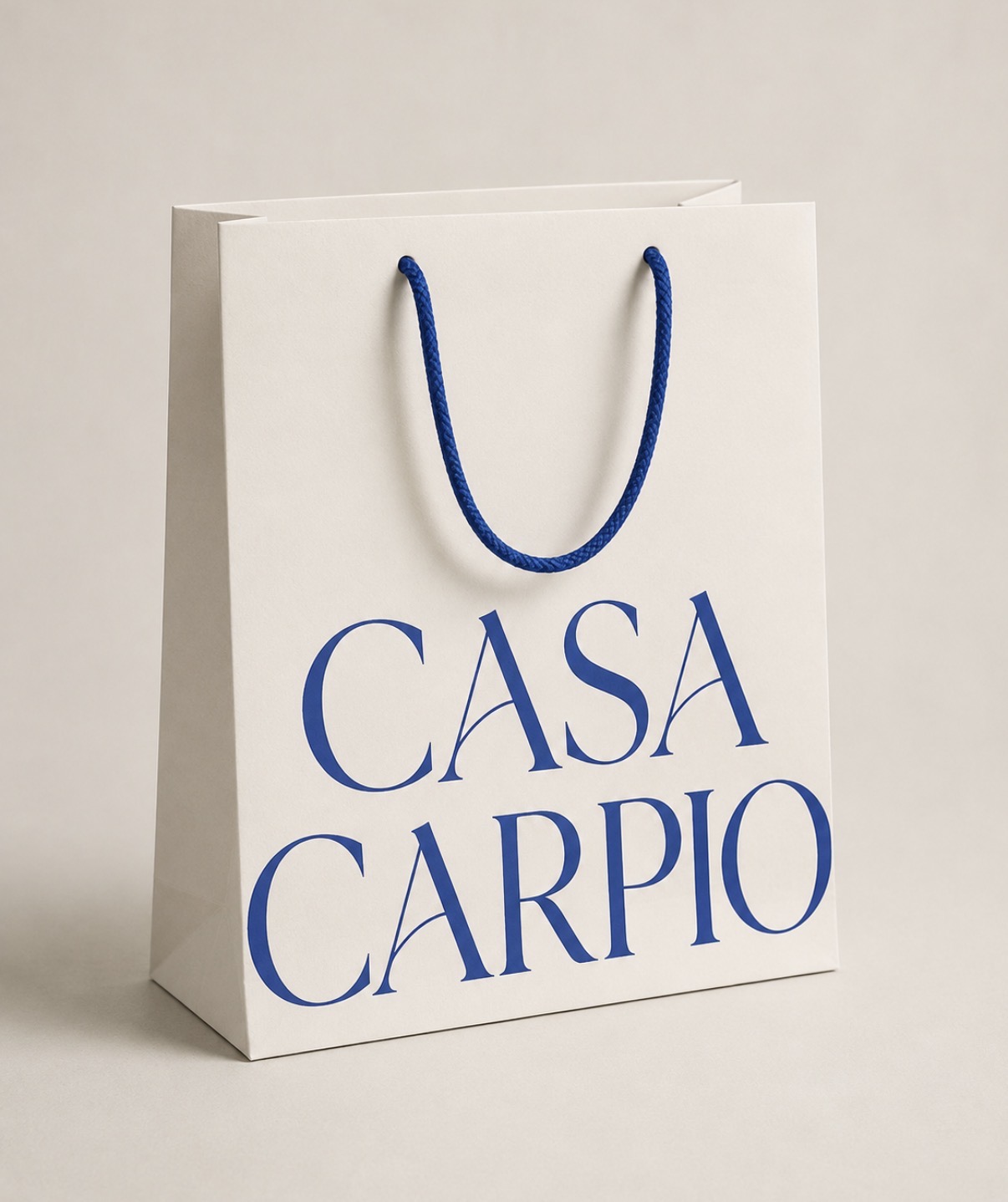
Casa Carpio makes small-run ceramics for the home: wavy candle holders, crumb trays, lamps that lean. The brand had to hold two things at once — the craft of a numbered edition and the looseness of a childhood sketchbook. So the identity pairs a wide, classical serif wordmark with hand-drawn line art and a single cobalt blue, printed on cream, glazed on clay.
Las piezas
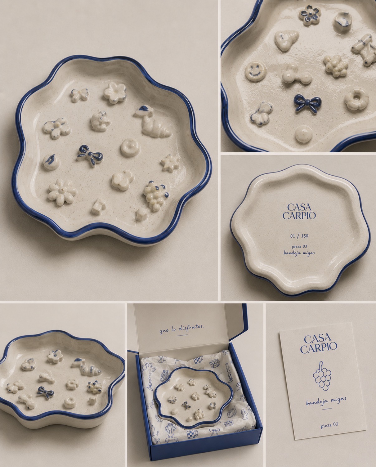
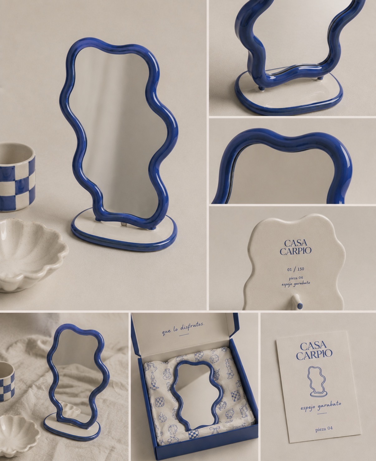
01 — 04 · 150 eachEach piece is named in Spanish, numbered out of 150 and signed on the underside — the label becomes part of the object instead of a sticker you peel off.
“que lo disfrutes.”
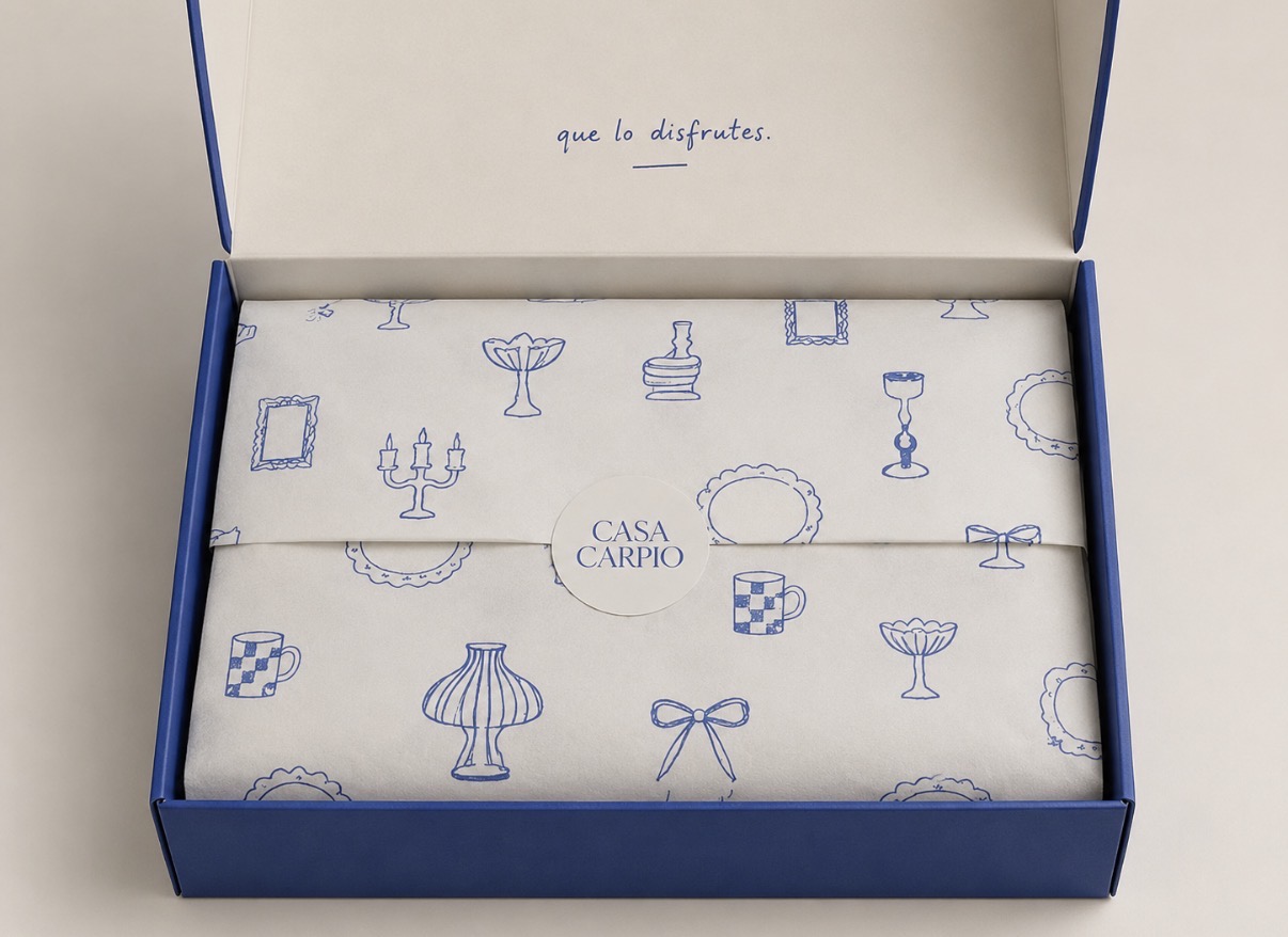
Two words, handwritten inside every lid. The whole tone of voice is that: familiar, unhurried, Spanish, said like someone passing you something they made.
Packaging
Unboxing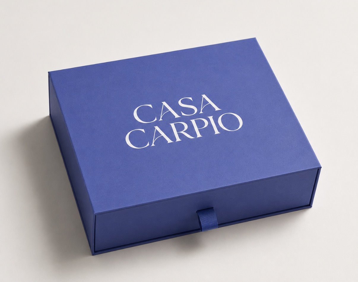
Next
GRRR →